
Bitcoin Signal - meet my BTC models
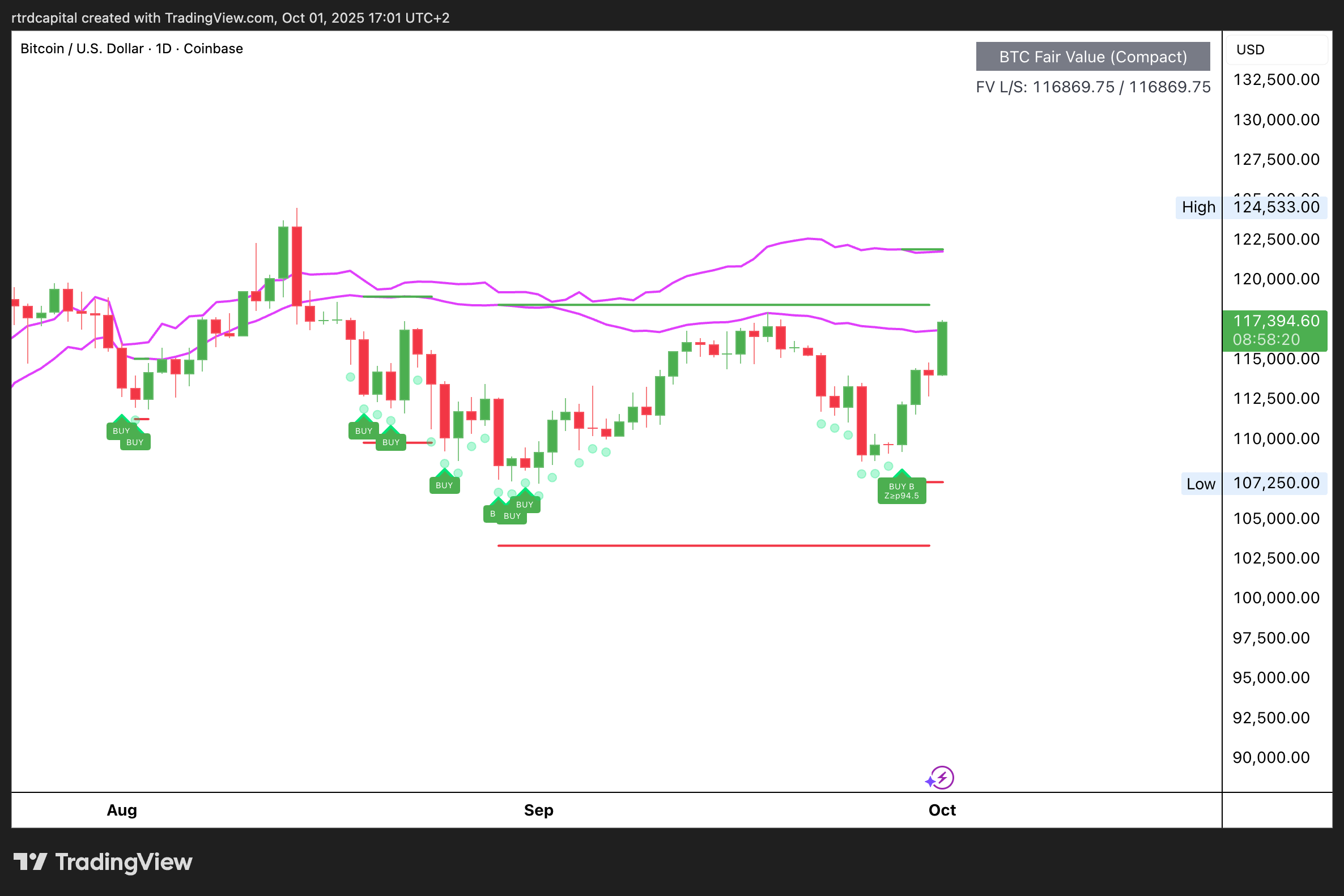
1. Bitcoin Fair Model - the “fair zone” of price
A dynamic corridor with upper/lower fair bands and a midline. It answers: “Are we discount, normal, or premium vs current vol and flow regime?”
On the chart:
Fair Value range (High/Low) + midline.
BUY tags print when price hits/sub-breaks the lower fair band in contexts where mean-revert odds are elevated.
A compact panel shows nearby references to plan entries/exits.
How to use:
With a bullish macro regime (see Macro Index), buy pullbacks into the lower half; trim near the mid/upper band.
In neutral/bearish backdrops, sell premium at the upper band; only take aggressive longs at the lower edge.
It won’t “call the day’s high”- it gives context: are we rich or cheap for these conditions.
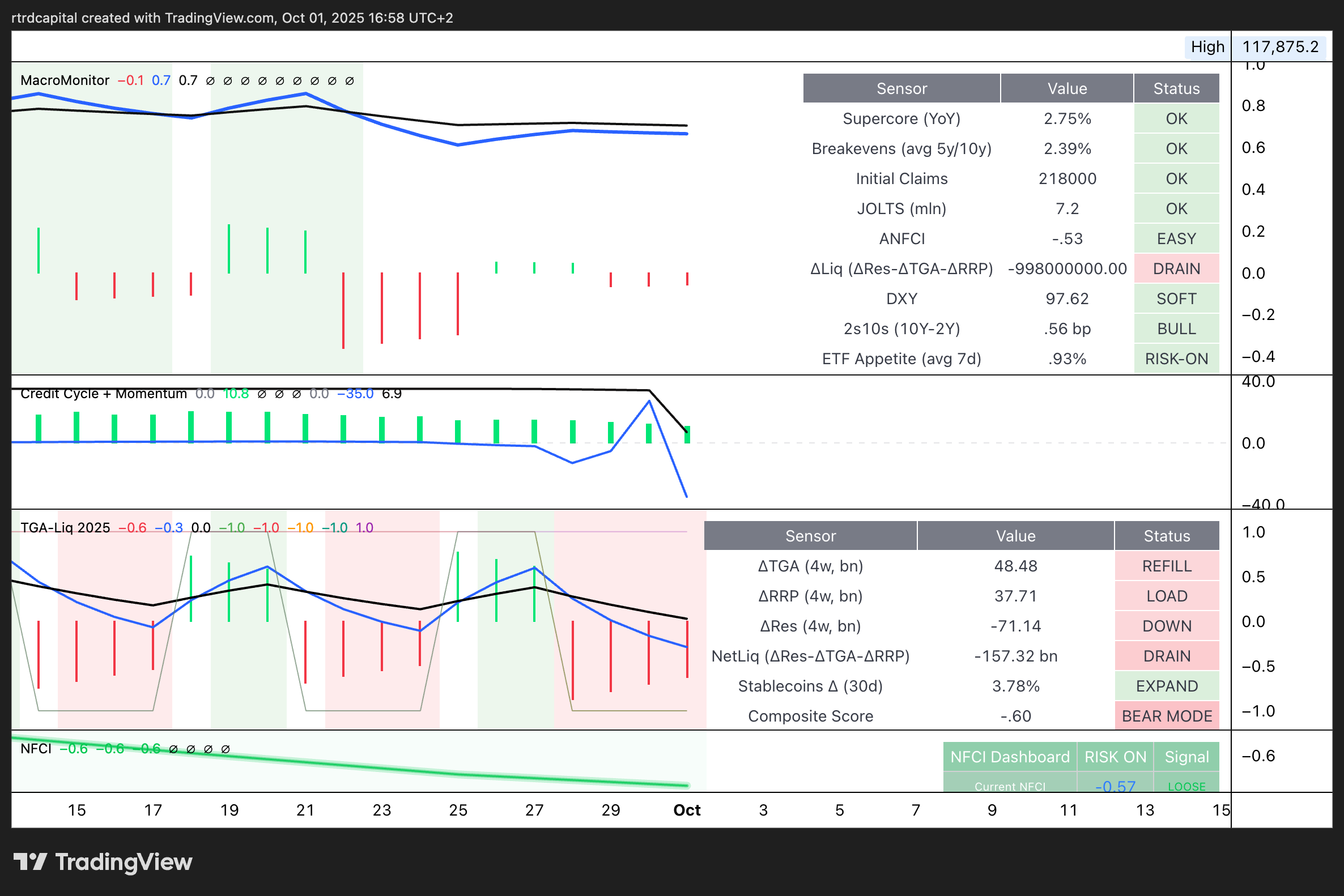
2. Bitcoin Macro Model - macro sensor dashboard
Not a single index - a dashboard of grouped sensors plus a composite Risk-On / Risk-Off read.
Tracked blocks include:
MacroMonitor - ease/tightness: core inflation, breakevens, labor (claims/JOLTS), financial conditions (ANFCI/NFCI), USD, curve, ETF appetite.
Credit Cycle + Momentum - where the credit cycle is and how fast it’s changing.
TGA-Liq / Net Liquidity - the plumbing: TGA, ON RRP, bank reserves, plus stablecoin proxies.
NFCI Dashboard - a dedicated lane for financial-conditions “strictness.”
Right panel: each sensor has a status (OK / EASY / RISK-ON etc). Bottom: composite score + final signal.
How to use:
If Macro Index says “bullish regime” and Macro Model confirms (Risk-On, positive sensors) = green light for “buy-the-dip” tactics.
If the composite drifts to neutral/negative (esp. due to tighter liquidity and rising real rates) = defense mode: cut risk, work the upper half of the FV corridor.
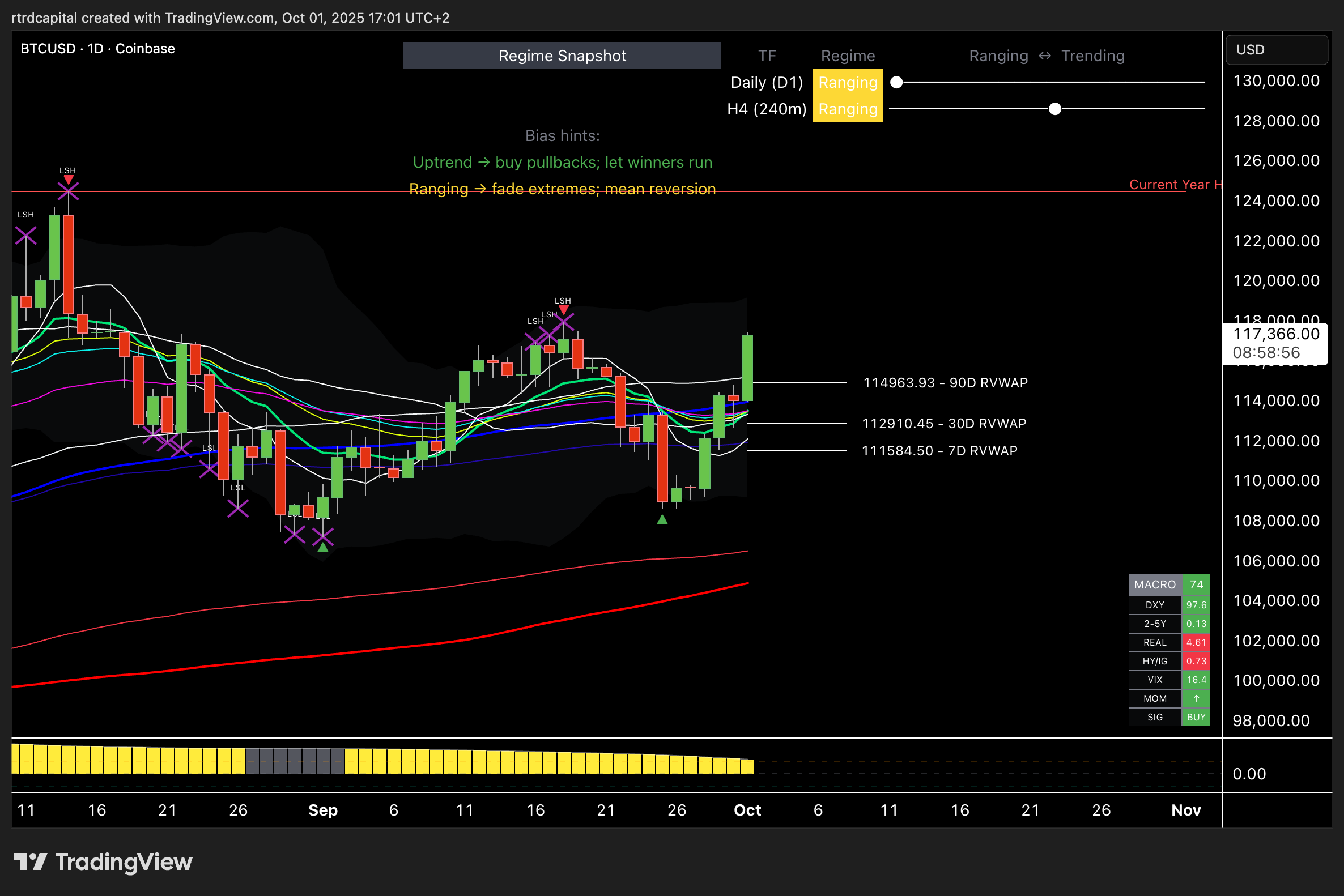
Bitcoin Regime and BTC Macro Index
A composite “macro-climate” oscillator for Bitcoin. It ingests several public factor groups (USD/vol, real yields & curve, Fed/Treasury liquidity, credit spreads, equity risk appetite), normalizes, aggregates, and smooths into one line.On the chart:
Histogram shifts color by regime:
Recovery — rebound from cheap zone (often cycle starts)
Expansion — sustained risk-on (base bull backdrop)
Slowdown — topping, momentum fading
Contraction — risk-off, historically the worst time to add leverage
How to use:
Weekly for cycle; Daily for near-term backdrop.
In Expansion/Recovery: prioritize longs/buy-the-dip. In Slowdown/Contraction: defend PnL, cut exposure, wait for better prices.
Treat it as a filter: it doesn’t pick the entry candle - it tells you direction and appropriate risk.
Why three models?
They answer three different questions:
BTC Macro Index - the climate: is the economy in risk-on or risk-off right now? (use it to filter trade direction and risk size)
BTC Fair Value Model - the valuation: where is BTC’s current fair zone; which levels are logical to buy/trim?
BTC Macro Model - the dashboard: what are the key macro sensors (liquidity, credit cycle, inflation/growth, USD, etc.) saying, and do they confirm the Macro Index?
Together, the trio helps you not fight the backdrop, buy with intent, and take profits when odds fade.